Recent searches
Search options

Administered by:

#variablefont


Happy accidents of the day while working on Pescante: breakdancing "u" and rotating "v" :---) #pescante #tuneratypefoundry #variablefont #typedesign #typography
Here you go @monokrom.
And thanks, it is a fun puzzle indeed.
This update has been rightfully requested a loooooong time ago by @haraldpeter.
Might still take a while to flatten everything, add kerning and make sure the replacement works everywhere.
But tricky letters are resolved now.

Typesetting a font specimen for a #VariableFont with #TeXLaTeX is one of the last adventures apparently ;)
But I got it working now. luaotfload seems to be buggy, but set to render the fonts with #HarfBuzz it seems to work.


Beautiful typeface Posthumous by Prologue Type #typeface #variableFont


#Solare is a grotesque #typeface published by @NikolasType, the Cologne-based type foundry of Nikolas Wrobel. Released in January 2024, its name is derived from the Italian words for sun and #solarenergy.
Also available as a #variablefont, its versatility makes it ideal for web design, #branding, #advertising and editorial #design.

An update for LTR Very Bauble! The original characterset was a bit sparse, so I added, oh, let's see, an asterism, at, sterling, questiondown, Eacute, Ohungarumlaut, Icircumflex, Scommaaccent, Lslash, Adieresis.alt and, let's see, about 2500 more of their friends! All animated with lines, thorns and pips. One axis, five masters. These letters were already having a party and now they are having a ball, waving their new flag and banners. #ad #update #tuscan #variablefont https://letterror.com/verybauble/index.html
It's fixed in more recent Linux distros. I usually use Debian for testing, which is known for its vintage versions ;) #gnome #kde #fonts #linux #VariableFont
It also happens in LibreOffice on Gnome with the Bold weight. I don't even have the slightest idea how to debug this. #gnome #kde #fonts #linux #VariableFont
Any idea why a variable font with weight (wght) and descender (YTDE) axes would show the short descender when I select the Light instead of the (default) Regular weight in KDE Konsole? #kde #fonts #linux #VariableFont


Trying to do a css only proximity hover effect with variable fonts.
I was nearly there and only than understood, that without javascript my variable font is not loading.
aww damn. 


my WIP #VariableFont where I am experimenting interpolation between two totally dissimilar designs, a Serif typeface inspired by LibreBaskerville, and a Blackletter typeface emulating Unifracture-Cook Bold.
Creating #VariableFont using #VariableComponent is fun with @fontra
Any recommendation for a nice variable serif web font for my personal blog?
I'm looking for something that is both aesthetically pleasing and easy to read.
And I totally wanna check out variable font. the more axis the better!

If you use the Affinity suite, be aware that the last update to 2.6.0 has broken the support of custom variable axes.
The sliders are only showing the defined instances and also use the internal rather than the external coordinates.
And yes I documented it and filed a complaint.

Gedanken zum Wochenende:
1) #Schrift kommuniziert nicht nur durch ihren Inhalt, sondern auch durch ihre Form.
2) #Typografie beginnt oft mit der Frage: »Welche Schrift passt?«
3) Traditionelle Klassifikationen bieten zwar Orientierung, werden aber der Komplexität digitaler Typografie (#VariableFont) kaum gerecht.
4) Eine universelle #Schriftklassifikation bleibt unerreichbar. Doch wie könnte ein zeitgemäßes System aussehen, das der modernen Typografie entspricht?

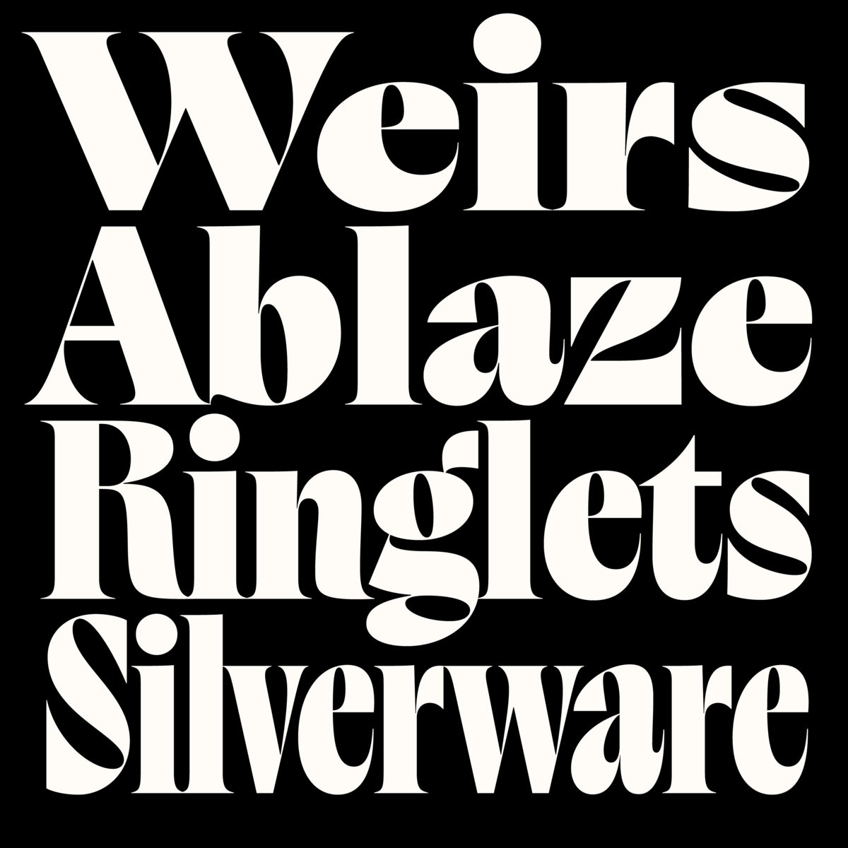
Salou!  I just have published a new slab-serif #typeface full of character and with clear historical references: #Salou. The font is available in 9 weights and two styles and all in one #VariableFont ! A great challenging design process...
More information about the font can be found here: https://viktornuebel.com/retail-fonts/salou/


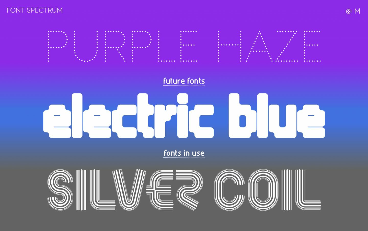
Bitzer is the latest #typeface by James Plattner, now available on Future Fonts @futurefonts Designed for headlines, #logos and editorial design, Bitzer’s narrow proportions allow for efficient #text arrangement without compromising #readability.  https://futurefonts.xyz/james-plattner/bitzer
A variable font with weight and serif axes :)
(Isn’t it remarkable that when you just slap some serifs on a narrow monolinear font, it instantly gives off Officina vibes?)
#VariableFont #Interpolation #Fonts #TypeDesign