
Administered by:

On the left is the syntax highlighting offered by Hugo for Elixir programs. On the right is the uncolorized, un-font-messed-with version. Which would you rather see in a blog post? Poll follows in response.
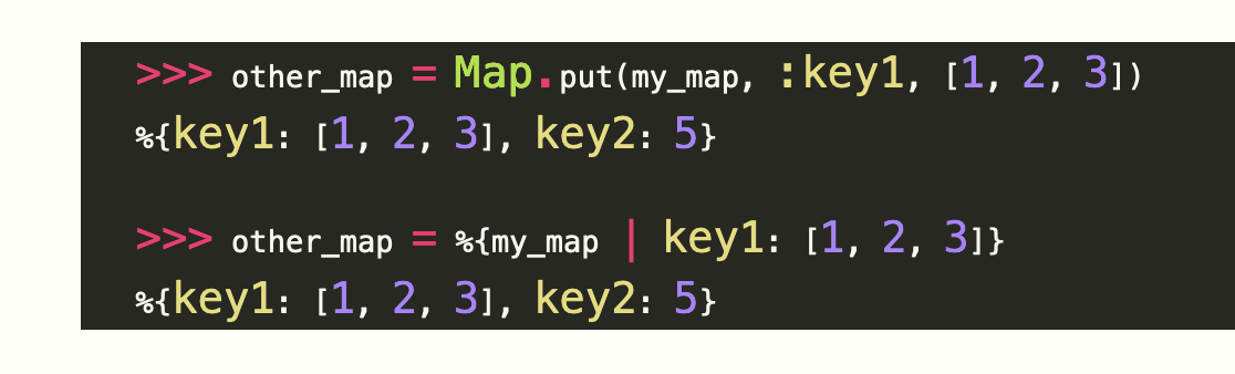
Which of the above representations of Elixir code would you prefer to see?

@marick oh yikes. Can I have colors, but without the weird variable font sizing? It looks like it's made from pasted together magazine clippings.


@bradwilson @jenniferplusplus I don’t know. I’m a newbie to Hugo and its font sizing. As far as I can tell, I only get one choice for code highlighting. (https://gohugo.io/content-management/syntax-highlighting/ suggests three choices, but they all actually do the same thing).
The font-sizing is horrible, I agree, especially because it highlights what I don’t look at and minimized what I do look at.

@marick Colors - just not THOSE colors. White/light background for documentation I feel.
@talios I too would prefer less IN YOUR FACE colors, but I’m more concerned with figuring out what in the toolchain DECIDES to capitalize CERTAIN classes of tokens that I think NOT SO important. No luck yet.


@marick i love colors but messing with font size triggers me in horrible ways
@windrunner I share your reaction. That was what prompted me to ask.

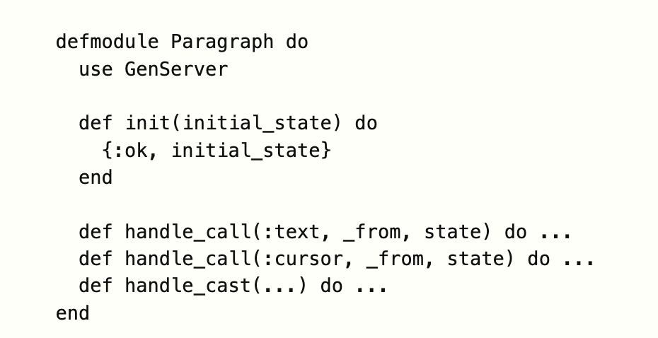
@marick: Not sure it’s a fair comparison because it’s not the same code.
The grayscale is more readable to me, but it’s not because of the colors or lack thereof.
I have a theme I use that I appreciate because the syntax “fades” while emphasizing the important things.
That said, my brain has never mapped in a way that themes become super helpful.
@marick: ps. Also appreciate less saturation for code in posts.
https://joshbruce.com/essays-and-editorials/webdev/absolute-beginners/styles/
@itsjoshbruce I think you and I have similar preferences. But I think I only get two choices with Hugo*: nothing or crazy font changes.
* Yeah, it’s just code, but I’m *already* going down two rabbit holes; I don’t need another.
@marick: Fair and understood. :)

@paulwilson Yeah, whichever choice is made, no one will be happy. Even the people on the winning side will be annoyed I didn’t do the winning thing the way they would have done it.
(I’m in a bad mood. I want to explore ideas, and all I’ve been doing is fiddling with tools whose unstated assumptions and preconditions aren’t ones I share. Bah! Humbug!)

@marick Colors, but ugh that changing font size 
@marick If that can't be changed, I prefer that b&w one
@renewiersma I haven’t found how to change the arbitrary font SIZE changes, so I’m using no coloring for now. https://nh.oddly-influenced.dev/2024/01/10/just-enough-elixir.html
@marick Sensible choice.

@marick my vote would be for monospaced in color. I think in this example the monochrome is better than the one with multiple different font sizes
@jnkrtech You and me, too, brother. But I think I don’t get that choice. Maybe I’ll ask around and there are other choices I can wedge into Hugo without going on a huge yak shaving expedition.

@marick I prefer you only color the code you’re trying to draw my attention to
@dimsumthinking I share your preference, but I’m stuck with preexisting templates.
What I’ve done in my books, given no other options, is put ^^^^^ highlighting under such text. I also repeat the snippets I’m talking about right next to where I’m talking about them. Scrolling around to see the code is for the birds.
@marick Yeah - sadly that led me to building my own. Generally code is colored one of the two ways you showed. The other advantage is my coloring works in light or dark mode on Apple Books.
@dimsumthinking Your yak-shaving prowess is something for us lazy people to admire.